The Foundry Workspaces
Website Design, Photography & Video Production for The Foundry Workspaces in Highland, Michigan
Making the space easier to understand online
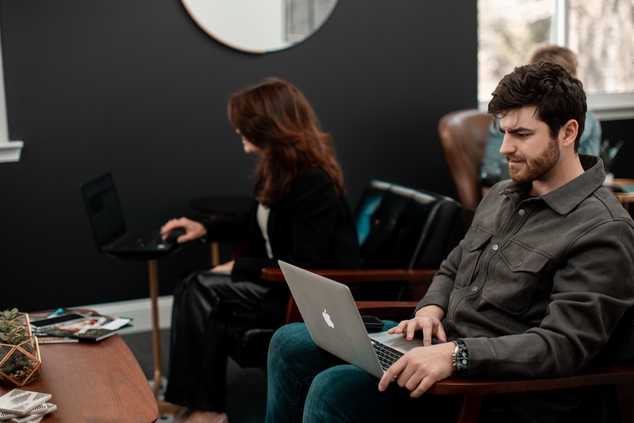
Coworking is one of those businesses where the space itself does a lot of the selling.
People want to know what the offices look like, how the common areas feel, what the atmosphere is like, and whether they can actually picture themselves working there.
That meant the website could not just list features and pricing. It needed to show the place.
We built the site around clear information, strong visuals, and an easier path for someone to understand what The Foundry offered before reaching out.
Building a website around the actual experience
The website was designed to give potential members a better sense of the space without making them hunt for basic information.
That included the different workspace options, the overall environment, and the practical details someone would want to know before booking a tour or making contact.
The goal was clarity first.
Make the space look good, make the options easy to understand, and make the next step obvious.
Keeping the visuals fresh
The relationship did not need a monthly production schedule.
Instead, we came back when there was something worth updating.
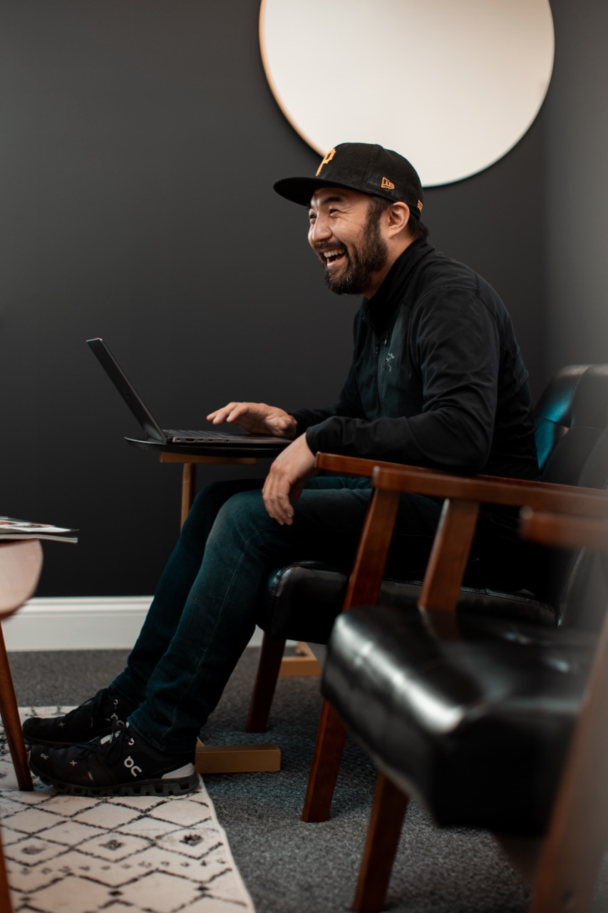
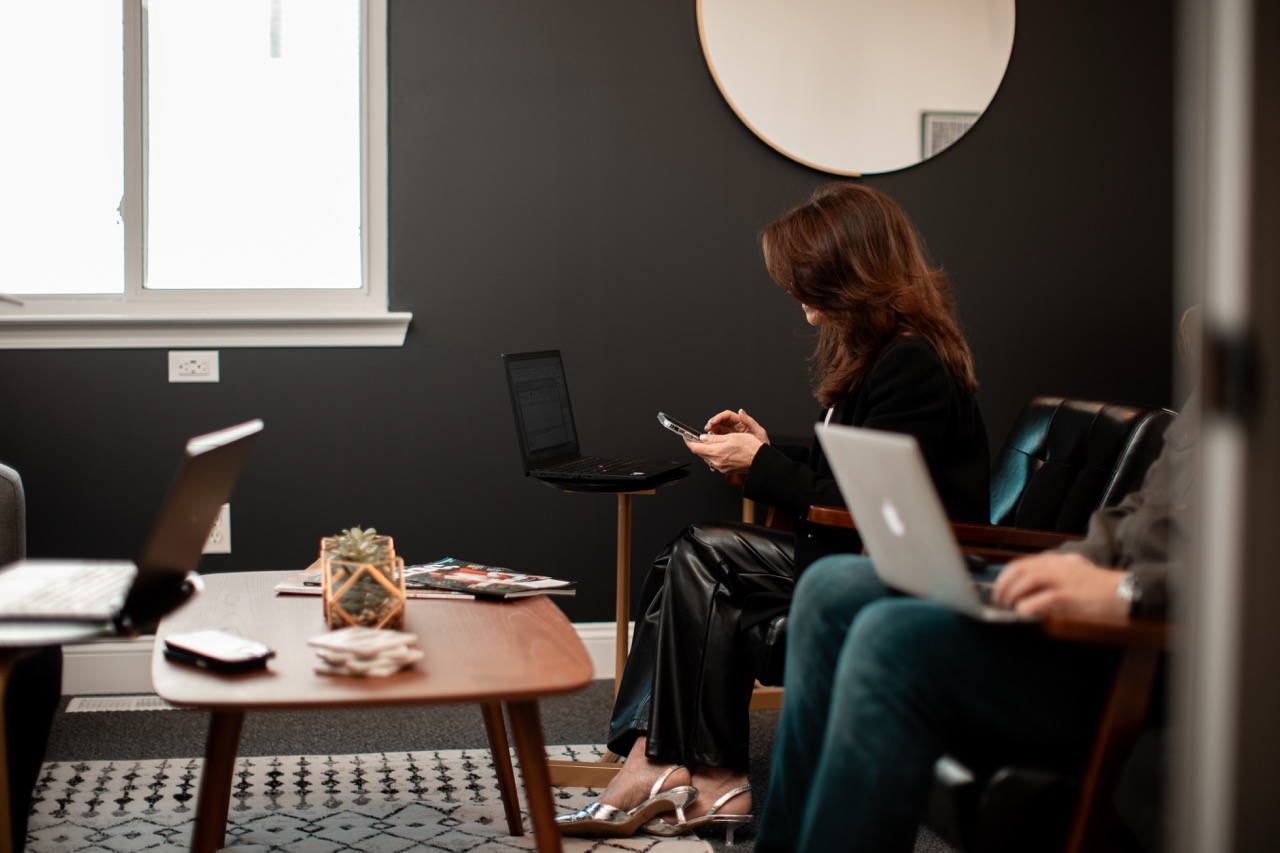
That might mean new photography of the space, refreshed video content, a new area to highlight, or visuals tied to a specific promotional push.
In practice, that meant shooting a few times a year rather than forcing content just to fill a calendar.
That approach kept the library current without creating more content than the business actually needed.

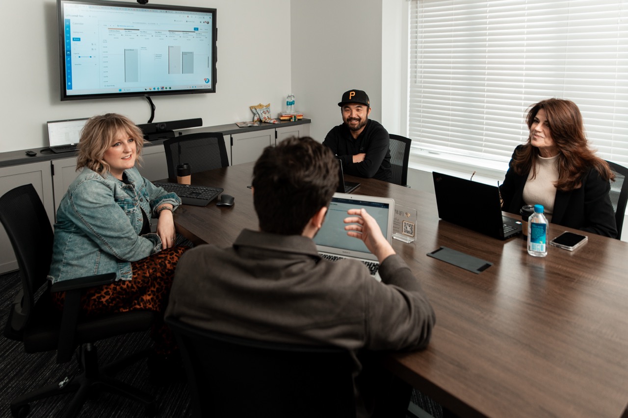
Photo and video built for multiple uses
When we came in to shoot, the goal was not to create one isolated piece.
We captured content that could work across:
- The website
- Social media
- Google Business Profile
- Promotional campaigns
- Tours and sales material
- General brand content
That gave The Foundry a growing bank of visual assets they could keep using between production days.
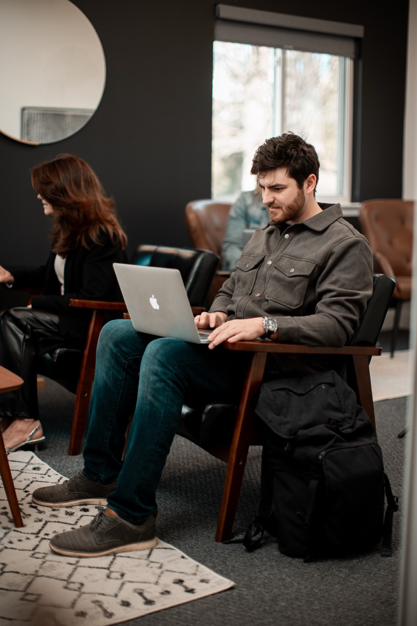
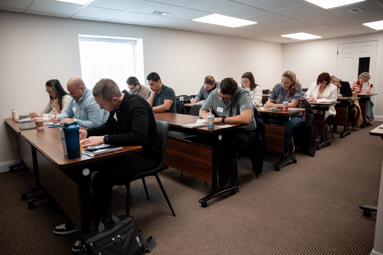
Showing the people and the place
A coworking space is more than desks and chairs.
The value is in the environment, the flexibility, the people, and the feeling of having somewhere professional to work without taking on a traditional office.
So the content focused on more than empty-room photography.
We wanted to show the space in a way that felt active, welcoming, and useful, while still keeping the visuals polished enough for the website and broader marketing.


Flexible support instead of forced consistency
Not every client needs monthly content.
For The Foundry, a more flexible rhythm made more sense.
We handled the bigger foundation with the website, then came back when the business needed fresh creative.
That kept the relationship practical and gave them access to professional photo and video without turning it into a retainer they did not need.
The result
The Foundry ended up with a stronger website, a clearer way to present the business online, and an expanding library of professional photo and video content that could be refreshed as the space evolved.
Instead of relying on the same old photos year after year, they had a way to keep the brand current without overcomplicating the process.
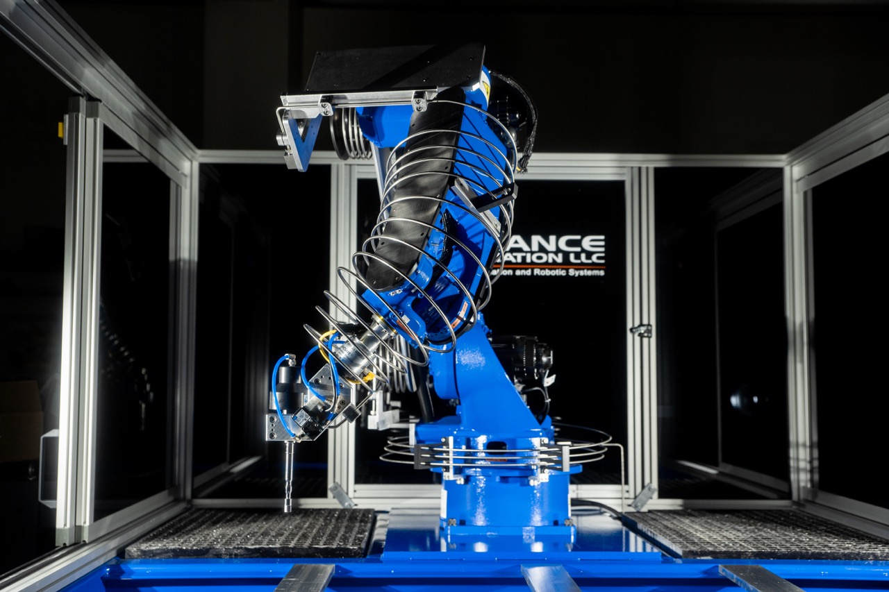
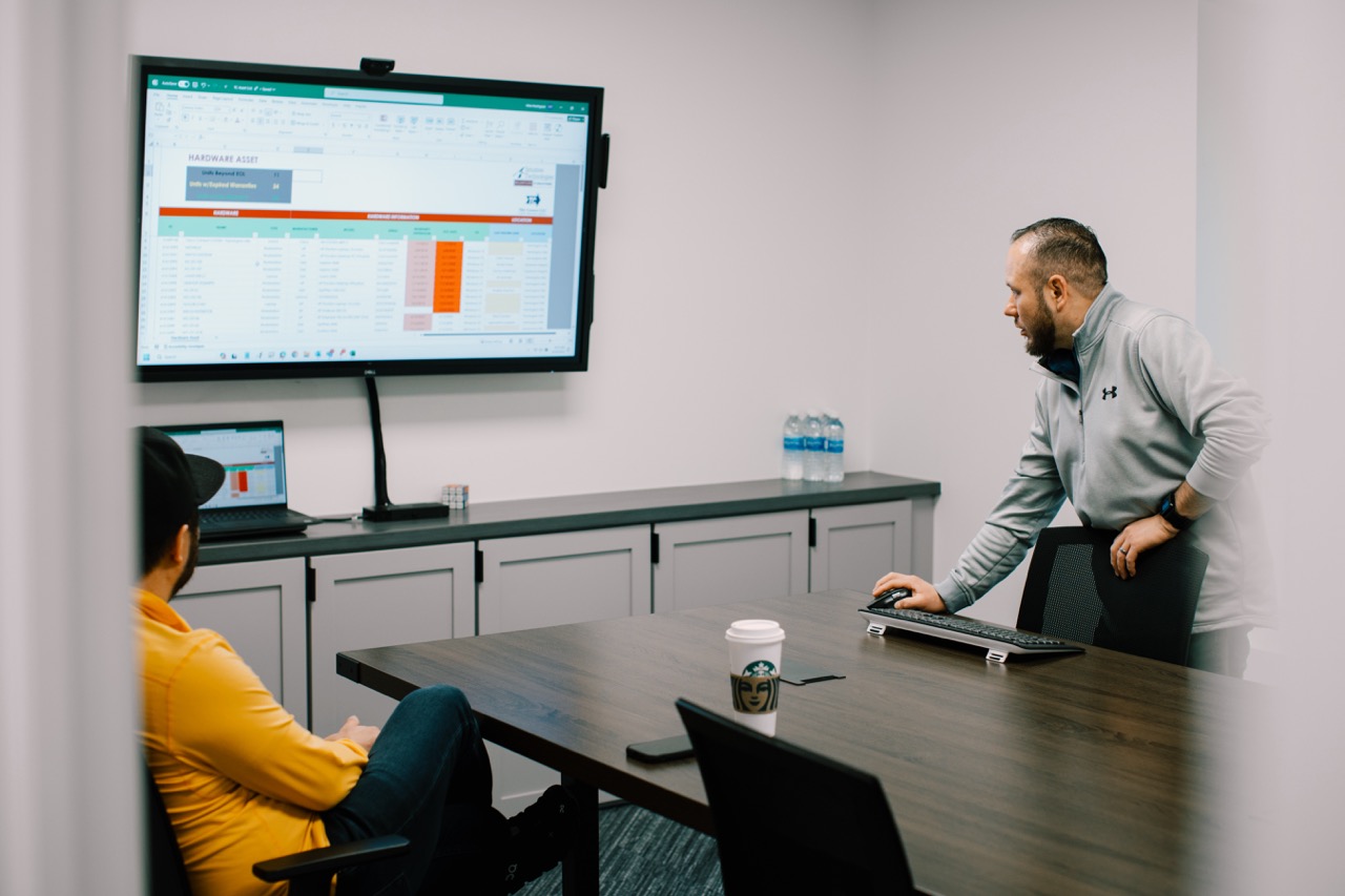
See our work
Here are a few other projects that show how we think, what we make, and where it all ends up.

Lets work together
Tell us what you’re working on, what’s not working, or what you’re trying to figure out. We’ll help you make sense of the next move.